As part of an immersive design course through the Interactive Designed Foundation, my task was to complete a sizeable project. I chose to create TIZON, a mobile app that allows users to find people and places to play or do sports.
I recruited respondents that do not exercise as much as they would like to who are smartphone users. I set up a face-to-face meeting with them to understand their needs, goals, and motivations. For that, I used quantitative interviews and cultural probes as research methods. Through these methods, I aimed to understand:
• Why do my respondents want to exercise?
• Why do they not exercise when they want to?
• What concretely happens when they do manage to exercise?
• What happens when something prevents them from exercising?
The interview questions written below changed based on the conversation with the respondents.
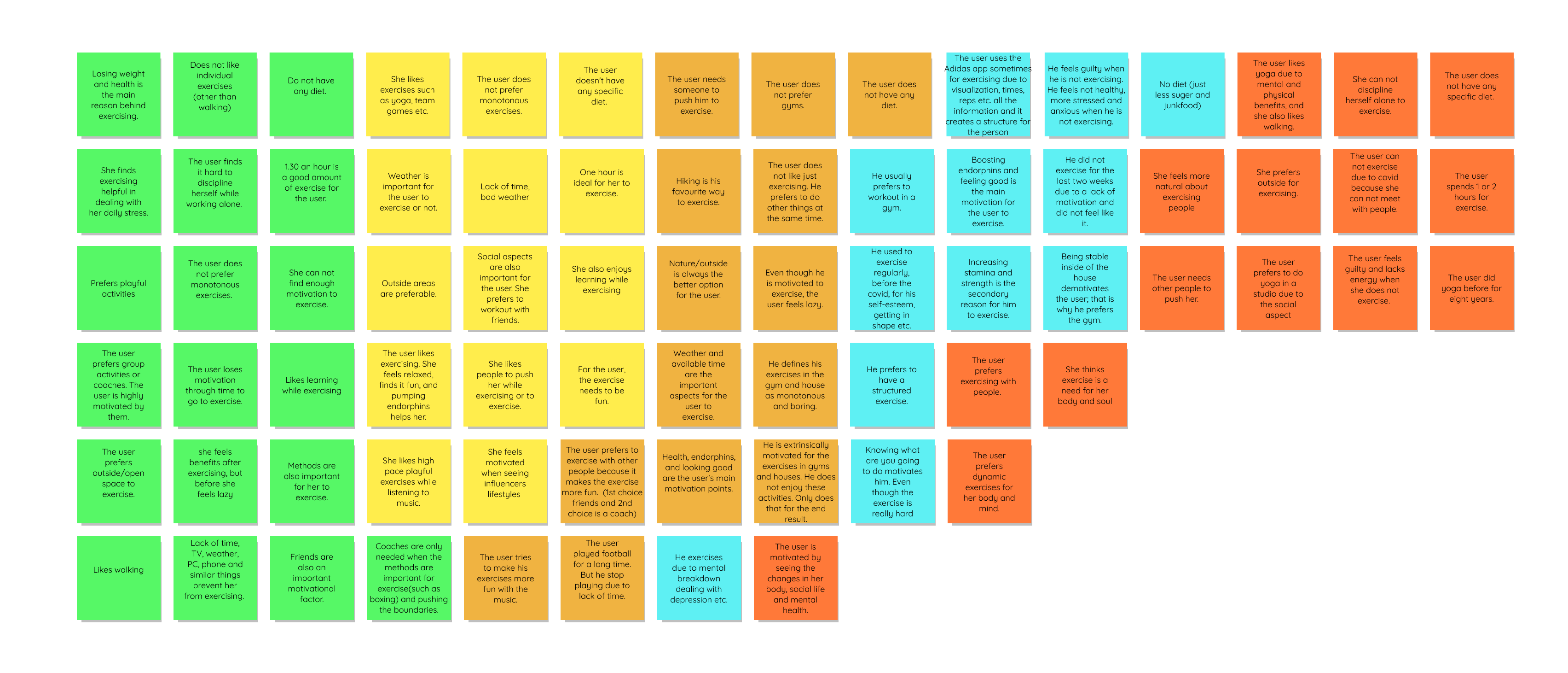
I analyzed the answers of my respondents and probes by sorting them into an affinity map. With that, I gained overarching insights. The research helped me understand major themes in my data, how the participants think, feel, talk, and act regarding physical exercise; synthesize the user needs, and define design challenges that I will tackle through the app.


For the ideation phase, I conducted a competitor analysis. This helped me understand the market, the existing successful services, and the best practices used in the industry. In parallel to competitor analysis, I generated as many potential solutions as possible through brainstorming. With that, I aimed to address the problem statements ( "How might we..." questions). Some of the ideas are as follows:
• Exercise battleground game
• Challenge each other through the app, based on the template provided by the app
• Virtual treasure hunt through a map where users can choose between walking or running. Based on their exercises, they will receive awards.
• A geosocial platform for people who want to exercise
• Video-call exercise.
The final idea was to create a geosocial platform for people who want to exercise.

Utilizing the gathered data, I created several user personas to represent users with different backgrounds and needs. I used these personas to understand user flows through scenarios for one of the selected ideas created via ideation session. I wanted to understand how my users would complete functionality and what they would need to accomplish that. In addition, I also created a possible site map and wireframes.
Firstly, I started by designing the logo and deciding on my primary colours. For the logo, because the app is a geosocial platform for exercising, I was inspired by city maps, especially figure-ground maps. I decided to mix figure-ground maps with the letter "T" while giving a dynamic feeling. For the colors, I decided on black for empowerment, white for elegance and yellow for energy and spontaneity.
After designing the colours, I start to build the component library for a consistent user interface and form a basis of a sustainable design system. For that, I utilized the Atomic Design by Brad Frost, Refactoring UI by Adam Wathan & Steve Schoger and the material design website. Colours, typography, and the collection of reusable components are as shown below.
After all these, I move to Figma for my high-fidelity wireframes and the prototype. While designing in Figma, I constantly conduct guerilla testing for my wireframes.
This project is a work of passion. My aim is to carry TIZON to its next level and see its full potential one day. To develop further, I will conduct usability testing with different participants. Hopefully, with the appropriate support, an MVP version will be out and let me see TIZON in action during everyone's daily lives so that I can learn from them.If you are interested in the product, please do not hesitate to contact me


